 menu
menu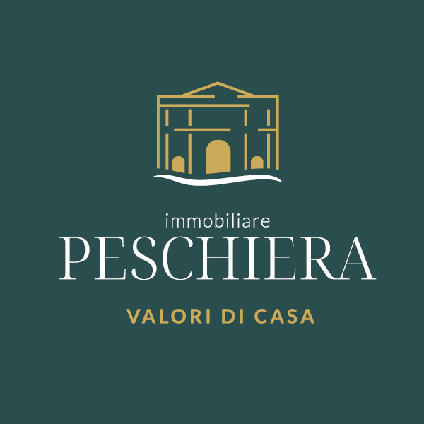
Immobiliare Peschiera
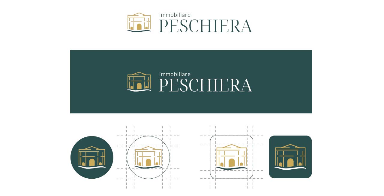
Restyling logo / Payoff
Immobiliare Peschiera is an agency specializing in high-end properties, but its positioning, thanks in part to its history and extensive knowledge of the area, wasn't conveyed by the old logo.
Furthermore, thanks to the blue waves of the graphics and the near-homophonous anagram between "peschiera" and "pescheria," the logo evoked a decidedly fishy feel. The lack of a tagline was also noticeable.
Old logo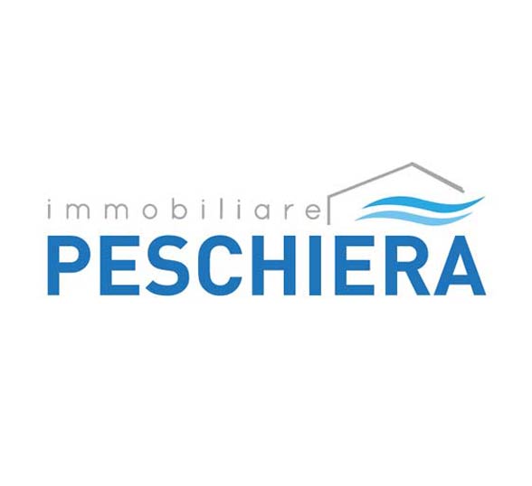
Restyling logo negative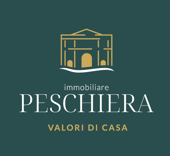
Restyling logo in positive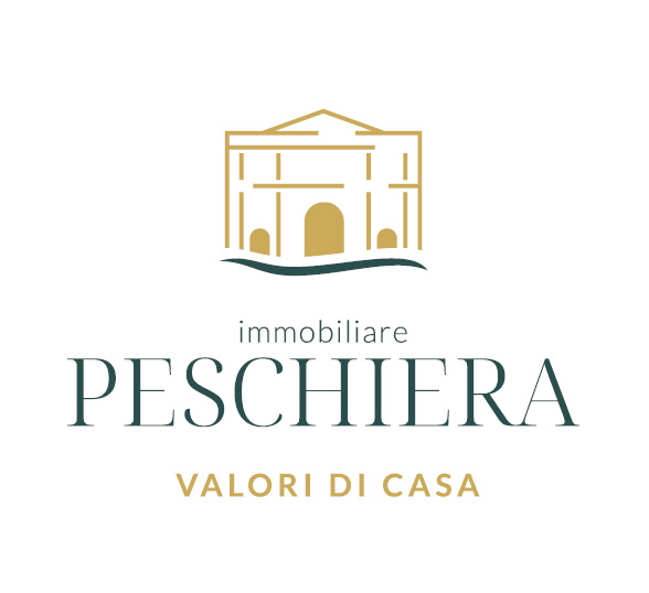
Concept logo
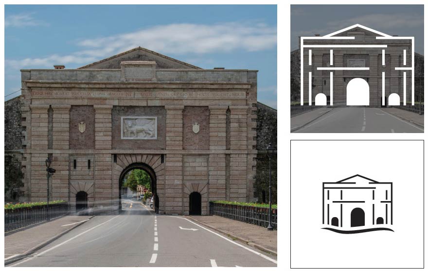
The design work It began by identifying a local landmark that could express values that had previously been overlooked.
The entrance gate to Peschiera proved to be ideal: a well-known and well-loved monument, with an architectural structure that evokes, in its tympanum, the idea of home.
The decision to retain the wavy design fulfills several objectives. On the one hand, it retains a subtle reference to the old logo while re-emphasizing Immobiliare Peschiera's territorial connection to Lake Garda.
With the development of the payoff the branding was finally found to be complete.
Porta Verona - Peschiera
Variants
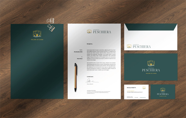
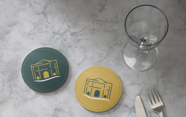
Applications
Contact us, we look forward to helping you.
Where we are
ABC STUDI SrlAdvertising Agency
Via Ponte Florio 70.d
37141 Verona - Italy
Contact us
Tel. 045.8868129Information obligations for public grants: the State aid and de minimis aid received by our company are included in the National Register of State Aid pursuant to Article 52 of Law 234/2012, to which reference is made, and can be consulted at the following link